
Toy Ventures brand identity
Fund overview
Toy Ventures is an operator led early stage venture fund focused on Crypto / DeFi, APIs / SaaS, Consumer Subscriptions, and Commercial Open Source Companies
Who I worked with
Solo project
What I did
Brand strategy
Brand identity
Presentation decks
Dates
April 2021 (2 weeks)
Summary
I created their brand identity from scratch. From concept, narrative, mood, colour palette, and typography, I worked with the founders to craft an extensible design system.
What they had
The founders gave me a sketched out logo and a colour scheme. They were adamant to keep the original colour scheme.

Inspiration
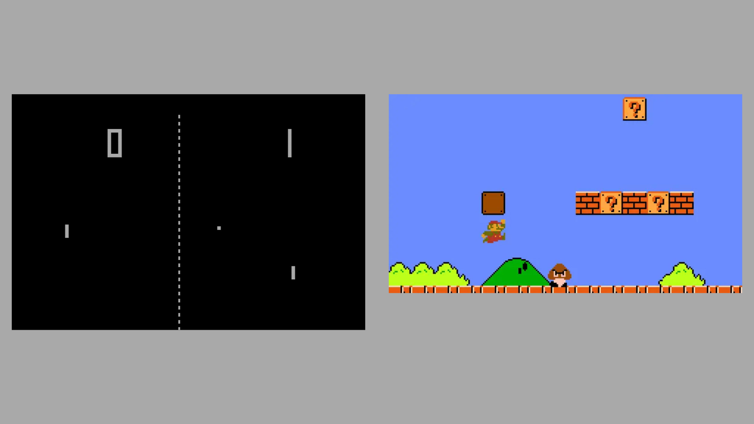
Research on retro 8-bit font types and color schemes reveal some appealing options for the new brand identity.
Bold and simple forms, saturated colors, and high foreground and background contrast are common features in retro arcade games.
Vox has a great documentary about the history of the 8-bit font, which is a key source of inspiration.


Sketching
I sketched out a few rough concepts that I discussed with the founders. They liked continuity with their original logo, so I went ahead and made a refined version of what they had drawing influence from retro 8-bit style fonts.

Alternative color schemes
After agreeing upon a general direction from my sketches, we went with the 8-bit concept.
Drawing from the aesthetic of retro arcade games, I offered some alternatives to their color scheme and logo.
The concept is inspired by the 8-bit grid—structure that encourages imagination.

Building a brand identity
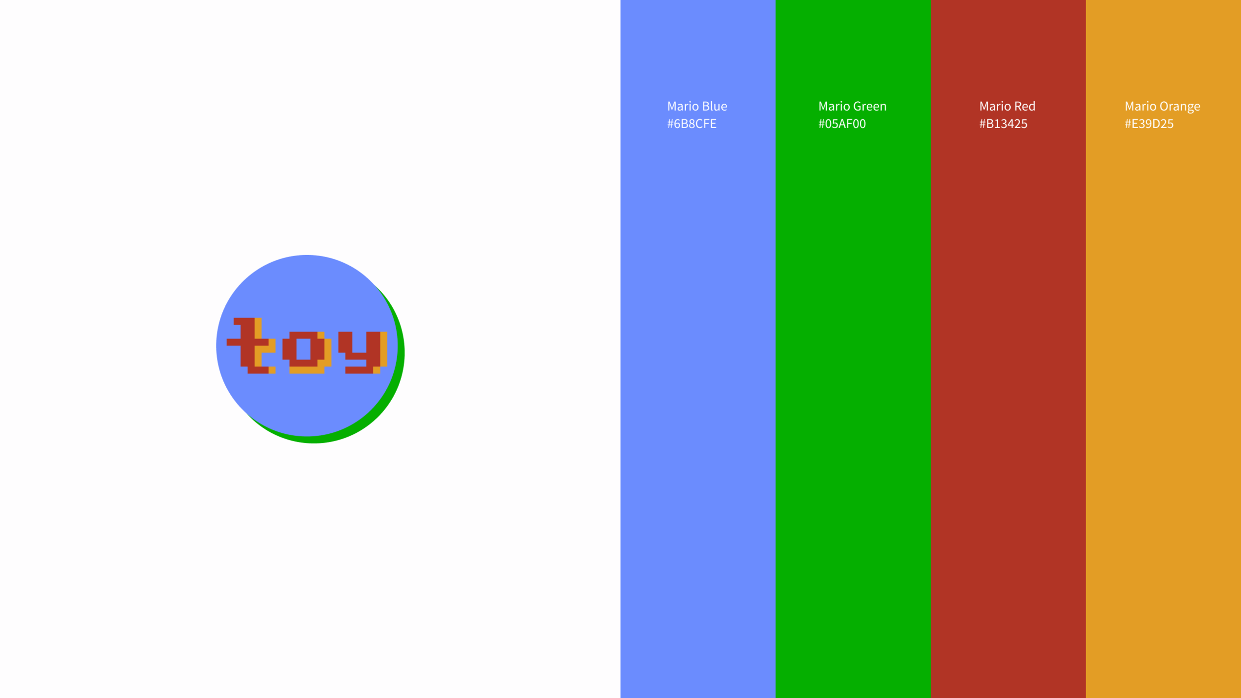
The logo we settled on is a more polished and conceptually grounded version of what they had. I fit the word, toy, into the 8-bit grid, and included a pink drop shadow on “toy” to echo their original design. They also wanted to keep their original color scheme.
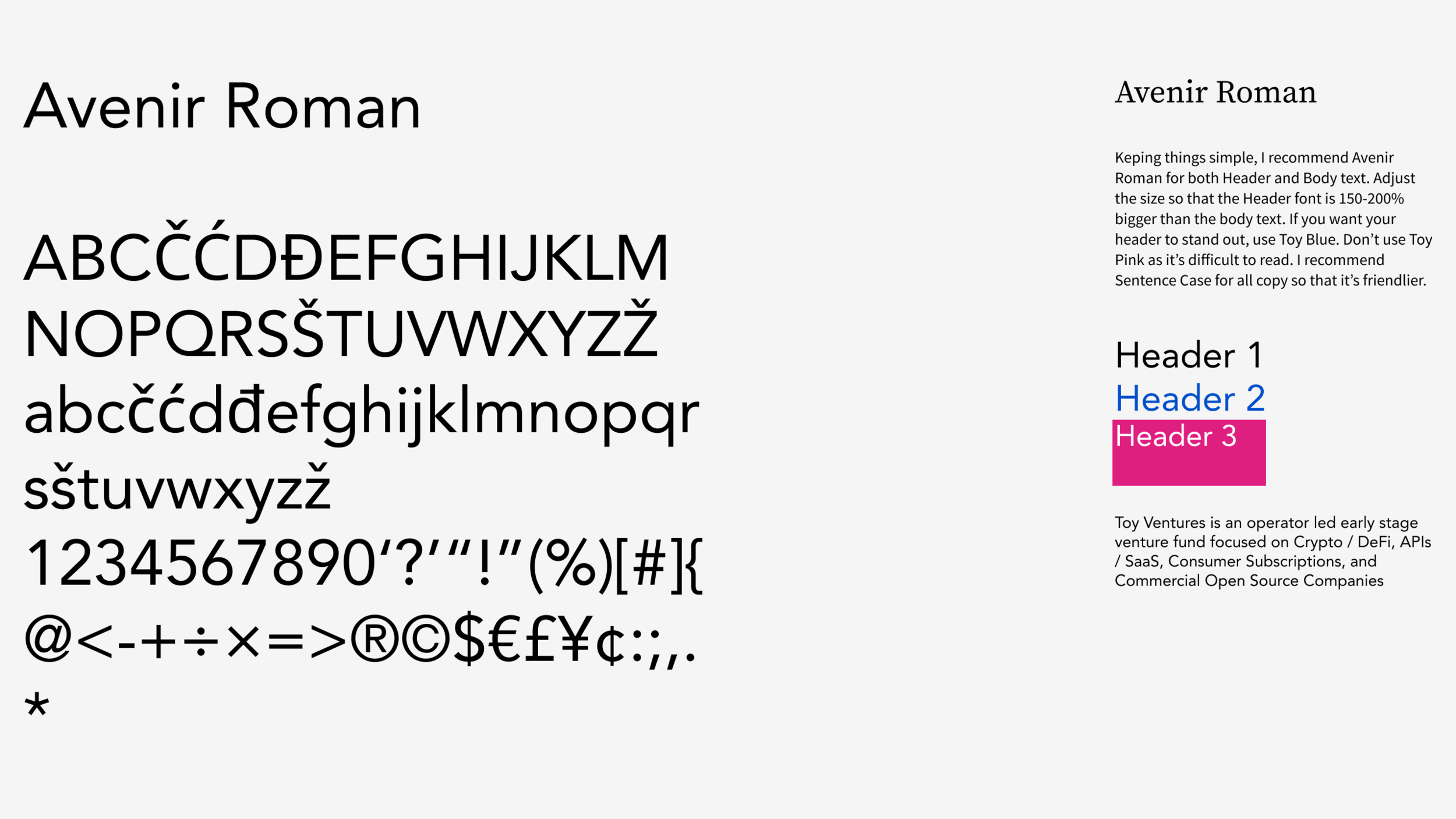
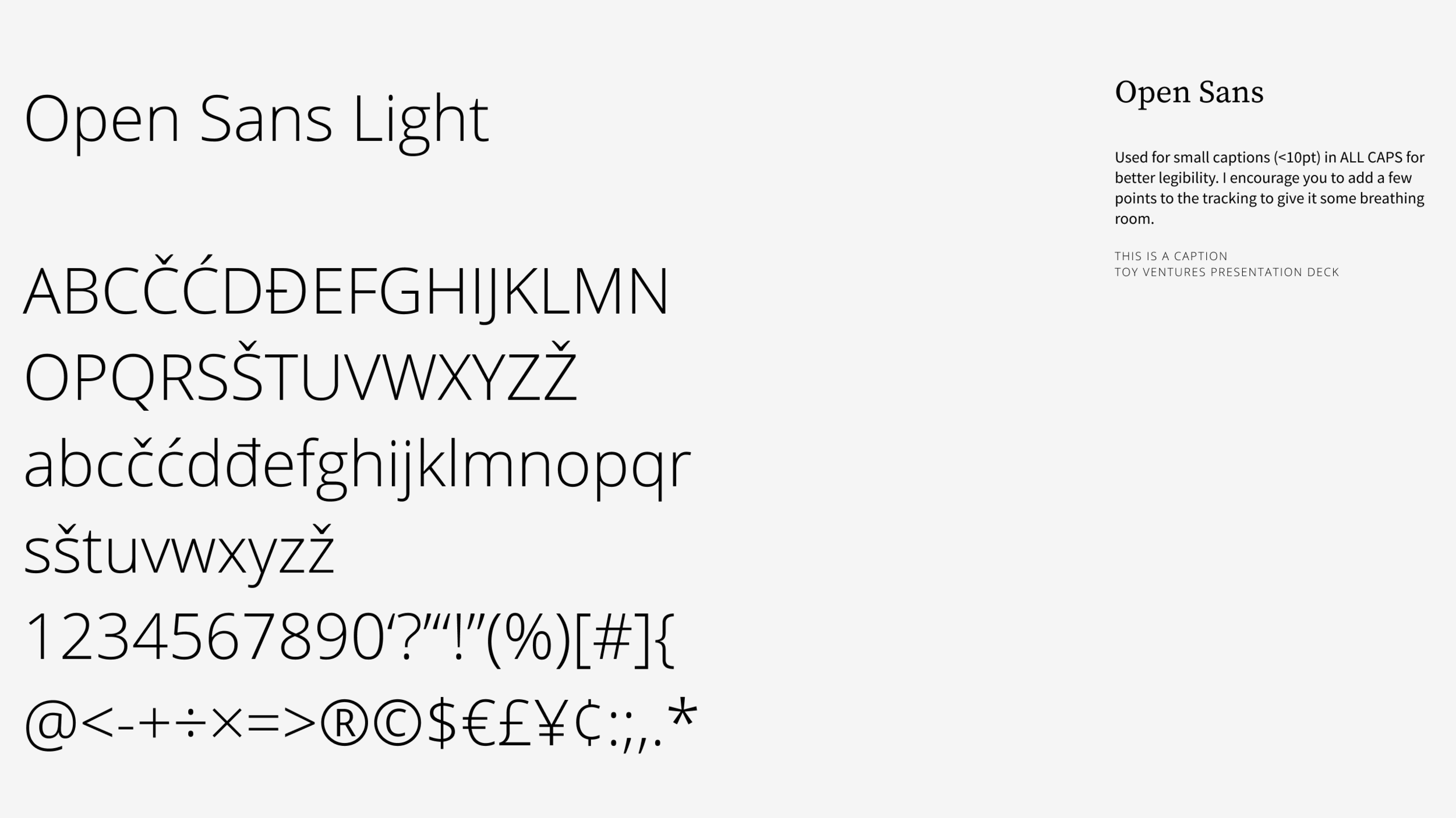
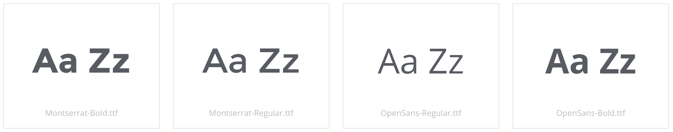
I proposed a geometric typeface, Avenir, to keep in line with the 8-bit grid concept for header and body text. The humanist typeface, Open Sans, is used for captions.

What I learned
Founders can have strong opinions that need to be respected. I pushed for a color scheme that I believed was more harmonious to the concept, narrative, and brand. I was happy to meet them in the middle.
Though it seems like I didn’t change much from what they gave me, crafting their brand and story from the ground up gave them more confidence in what they are selling.

Kanjoya brand refresh
Company overview
Kanjoya was a fifty person startup based in San Francisco. Our product is a workplace intelligence platform that uses natural language processing alongside machine learning to analyse employee surveys and quantify employee values, biases, attitudes, engagement, and performance traits.
Who I worked with
Geri Cruz, CMO
Kate Barrett, Design Director
Anya Nikulina, Sr. UX Designer
Varun Mehra, Visual Designer
What I did
Visual design
Marketing strategy
Dates
September 2015 – December 2015 (3 months)
Summary
Customers and Sales gave feedback that our brand identity was too focused on the tech. It needed to instead communicate how it empowered HR professionals and employees.
What we had
Prior to this effort, we had no guidelines and a stale visual identity, which forced our Design team to make bespoke collateral for Sales and Marketing. This led to confusion when we sold. We were also competing with CultureAmp, SurveyMonkey, and Glint. Customers would comment that their products and branding were sexier than ours, but still chose us for our technology.
What if we could sell on our technology and our brand?
As a Growth PMM, I worked directly with our CMO and design team to rebrand our existing logo and develop brand guidelines. I gathered insights from our executive team and customers to inform our design process. The goal was to create a cohesive strategy that aligned with our company’s mission and product values.
Original brand
Our old website combined with several free floating assets consisted of our old brand identity.

Moving away from our tech
We assessed the pros/cons of our original brand. Kanjoya had best in class tech, which HR Analysts loved. They would tell us how much they enjoyed drilling into the data and insights. However, our buyers, either CHRO or VP of HR, didn’t care as much about the sophisticated tech, but wanted to know how our product would evolve culture, improve engagement, and give them more leverage to drive change at the C-suite level.
We also wanted our brand to align with our values: improving culture and empathy through technology. Our final requirement was to have extensible guidelines to inform future product designs and Sales collateral. We had several brainstorming sessions to generate ideas.
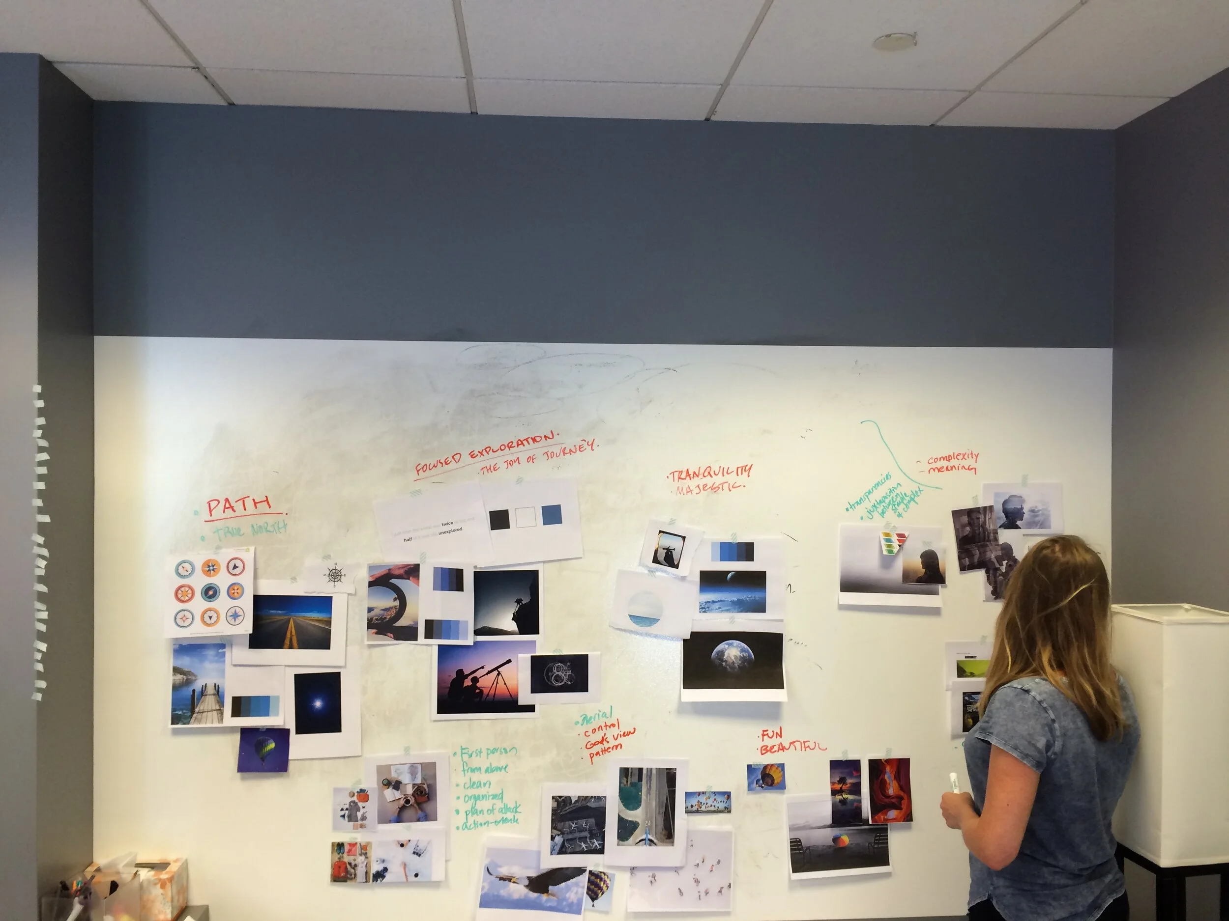

Distilling our ideas
We distilled our brainstorming sessions through votes from our group alongside input from the rest of Kanjoya. We sketched out what components were required to make up our guidelines. We shopped this around Kanjoya and built several iterations on InVision boards before testing our guidelines.

Getting feedback from the team
We used InVision to create higher fidelity tests. We shopped a few iterations of these boards around Kanjoya before settling on the final guidelines, which is what you see below.
Updated brand

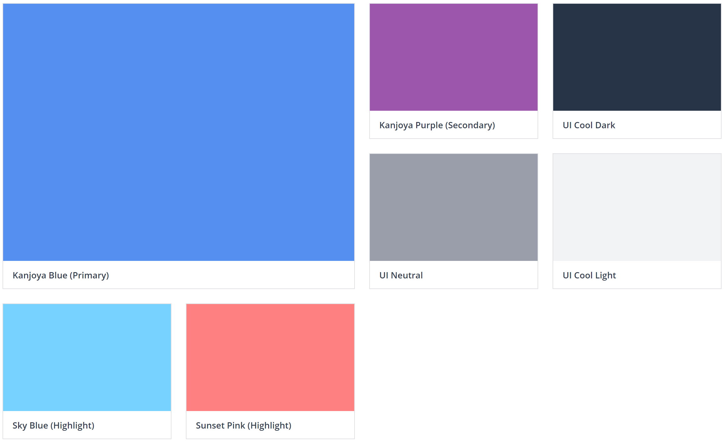
Brand colors
The Kanjoya brand colors are inspired by the color spectrum in the evening sky. Kanjoya Blue is the most associated color with the brand image and Kanjoya Purple can be used to play a supporting role. The highlight colors should be used to give depth to elements (such as buttons and icons) that use the Kanjoya brand colors as a base.
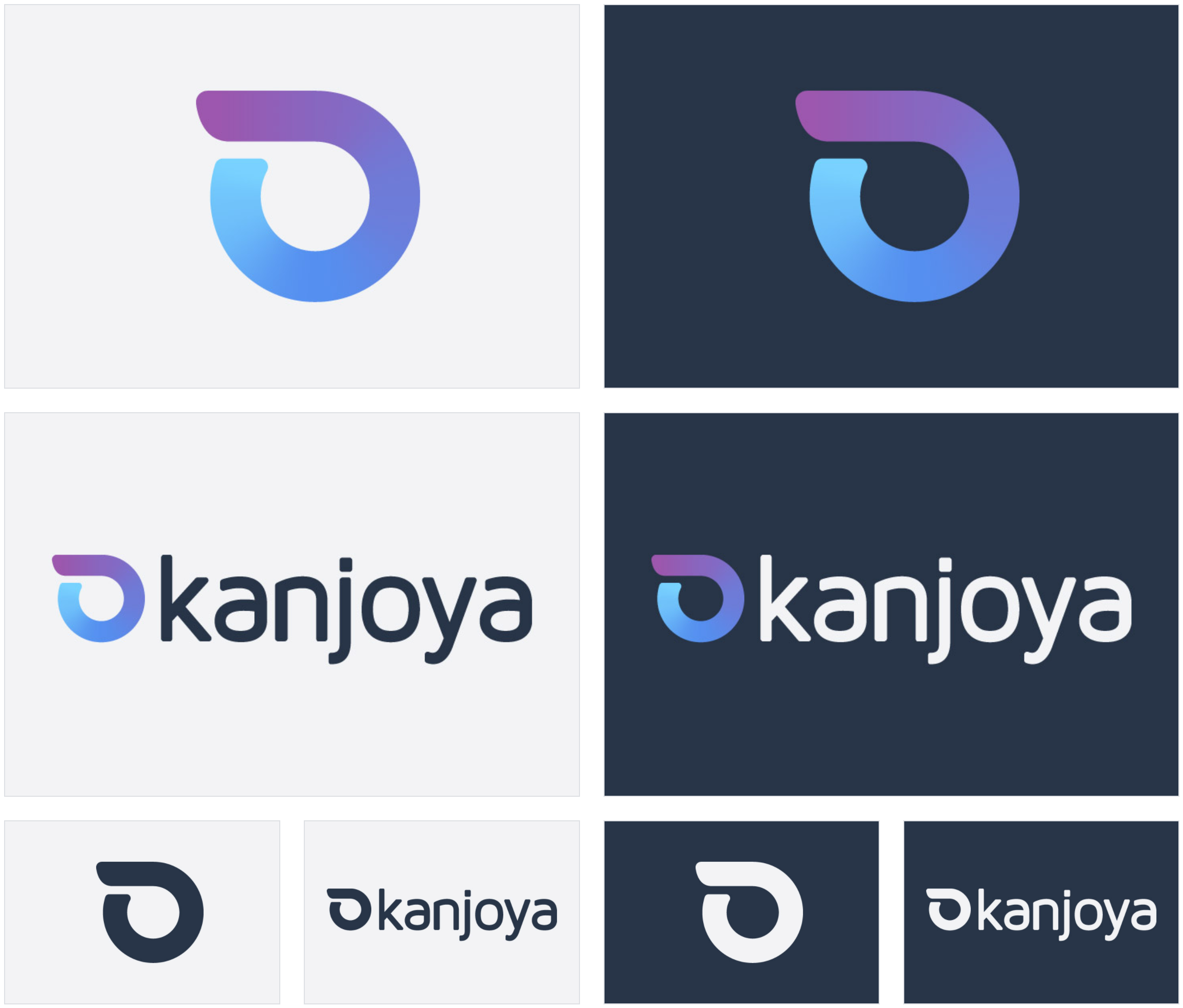
Logos
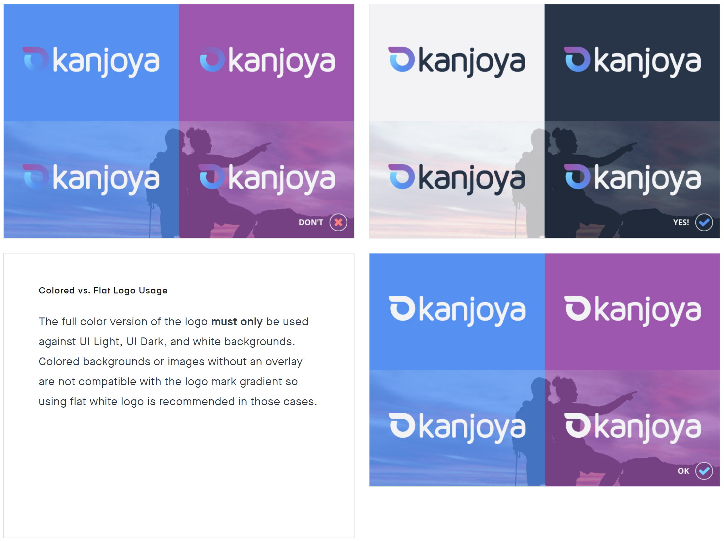
Logo usage
Typography
Design anatomy
Image overlays, gradients, icon styles, buttons, typography, product mockups, etc.


What I learned
Building a compelling brand starts from compelling storytelling. Thinking about the value we were delivering through our product and how it could be reflected through our brand was far more effective than focusing on our core technology. I think because our core technology is so compelling it was easy to fixate on.